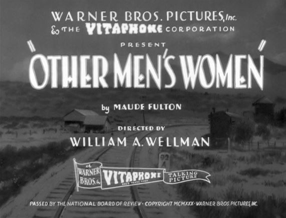
Title Design
Title Font- The idea was to use the font Times New Roman, in bold, to display all of the titles, including
the title of our final project. This font was used to keep the idea of the oil simple but with a classic tone
to ensure there isn't too much focus taken away from what the characters are doing in the background.
(Times New Roman)
Title Color- We plan to have each of the titles done in a dark red color to hint at the darker theme of the
film but to also make sure the titles can be seen against the lighter indoor setting. (Example)
Title Size- The most likely title size for our project will be a medium-large sized font, that would take up
the corner of the screen but not too big of a space, to not cover the background. Titles such as "Directed
by:", would be in a size bigger than the name that would follow that title, ex. Directed by: Katherine V.
The title of the movie is also going to be significantly bigger than the other titles, in a large-largest size,
that will take up up to half of the screen, ex. Title
Title- "Omniscience"
The titles will enter and leave the screen through fades in and out of the screen behind it, while each title
will last for about two and a half seconds, so the titles aren't being shown through the entire film portion, but won't be on and off the screen in the blink of an eye.


Comments
Post a Comment