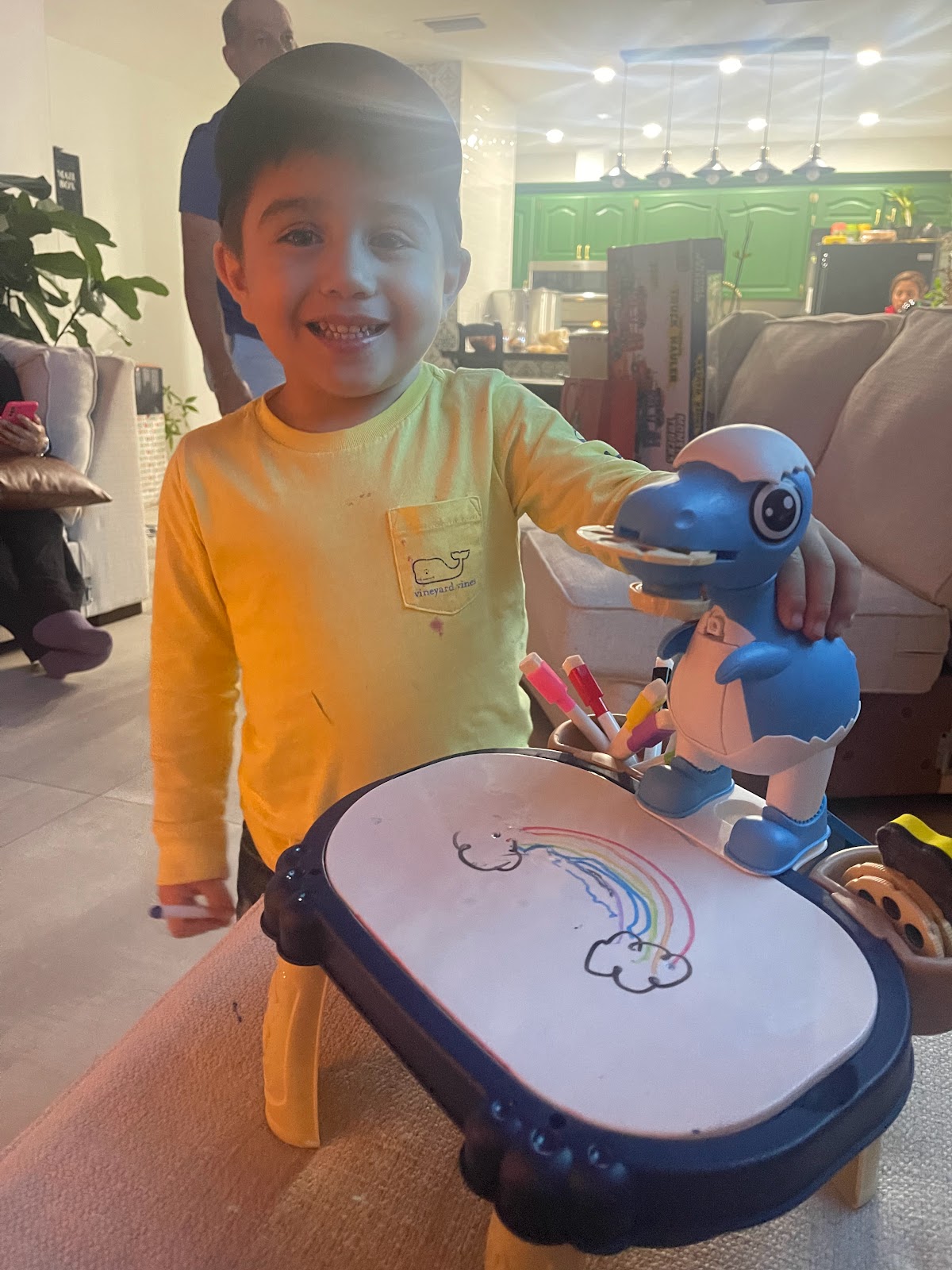
Welcome back Camination!! In this blog I will be updating you guys on the filming of me and Katherine's short film. We have filmed for two days overall but today I will only be talking about the first day. We began filming February 14, 2024 after school. On this day we wanted to shoot all the scenes that Santiago was in since that was the only day we could see him. We started by setting up everything he would use in the scenes (markers and paper.) We had to explain to him that all he had to do was draw on the blank piece of paper. It took us a few tries for him to actually draw something that wasn't just scribbles so we ended up helping him. We drew multiple different things that were simple doodles of things like rainbows, cars, trees, and animals. For Santiago to know what to do we had my mom help explain to him since he is just a toddler. Although we had to redo many shots because he would get easily distracted. We were able to get some pretty good shots that we wil...
Hi, Camination. Welcome back to my blog!! I completed my editing with Katherine today, but there is still more to be done. We had completed the ordering and assembly of the clips before today. We ensured that the clips were sufficiently cut to blend into one another. We then inserted the necessary titles after that. The size of each title that was given to a clip had to vary based on what was seen in the frame. But in every clip, the font used was the same. At the conclusion of our previous blog, we said that we were searching for our soundtrack. We are having some difficulty obtaining the ideal sounds for it, so we have decided to postpone it for a little while longer. We also determined that the addition of music might wait because we are experiencing trouble muting some of the clips. Today, we focused our editing efforts on altering the filters to enhance specific shots. There are often similar looks to key scenes in thriller films. The photos that are the scariest and most sus...
www.artofthetitle.com Outbreak What titles are displayed during the opening sequence? The first titles given are the main actors of the movie, then followed by the title of the movie. Then comes more of the actor's names, the people who casted the actors, the costume designers, the music composer, the co-producers, and the editors. Followed by that was the production designer, the director of photography, the executive producers, the writers, the producers, and the director. What images are prioritized in the opening sequence? In the beginning of the title sequence, there is the image of an explosion happening in what looks like a jungle and a camp on the outskirts being deserted, and then a wide shot to show the full scale of the explosion. After that, the title of the movie is shown on a black screen, and the next scenes are shown to tell a story. We are introduced to an Army Medical Institute, and we follow employees here through the different Biosafety Levels that are being wo...

Comments
Post a Comment